Select a site alphabetically from the choices shown in the box below. Alternatively, browse sculptural examples using the Forward/Back buttons.
Chapters for this volume, along with copies of original in-text images, are available here.


Object type: Centre of cross-head [1]
Measurements: H. 17.5 cm (6.9 in); W. 17.5 cm (6.9 in); D. 14 cm (5.5 in)
Stone type: Fine-grained, dolomitic, white to very pale brown (10YR 8/2–8/3) limestone; Lower Magnesian Limestone, Upper Permian; probably reused Roman ashlar, originally from Tadcaster area (see Fig. 5).
Plate numbers in printed volume: 232-236
Corpus volume reference: Vol 3 p. 85-87
(There may be more views or larger images available for this item. Click on the thumbnail image to view.)
A (broad):
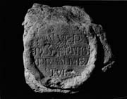
Inscription The finely cut inscription, further discussed in Chap. 12 (p. 45), is set within a roundel defined by a raised circular frame at the centre of the cross-head. The inner diameter of the roundel is about 8.5 cm. The letters, which are capitals, are very small: about 1 cm high. The text reads:
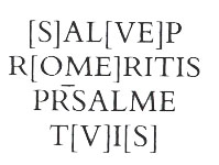
The reading is unproblematic: SALVE PRO MERITIS PR(E)S(BYTER) ALME TVIS ('Hail, gracious priest, on account of your merits'). The letters are delicately cut with fine serifs. The four lines of lettering are set between lightly incised guide-lines, which touch the tops and bottoms of letters of standard height. This is comparable to the stylus ruling of vellum in some particularly luxurious Insular manuscripts (e.g. Lowe 1960, pl. VIII; Lowe 1972, 20, 43, nos. 187, 274; Brown 1982, 108). This unobtrusive ruling is quite distinct from the deeply incised and plainly visible ruling set between lines of lettering without touching them, found for example, on the St Mary Castlegate inscription in York (p. 46). The lowest guide-line on this stone was set a little too high and was ignored when the letters were designed and cut.
The letters are Classical Roman capitals or variants of them, like the open-bowed R (perhaps influenced by the Insular half-uncial letter), or the M with vertical outer strokes, known since the Early Christian period. The second A is the uncial letter. Ascenders of L and descenders of P and R extend beyond the guide-lines (cf. Lowe 1960, pl. VIII). PRO is irregularly split over the line-end. An unusual 'capricious' abbreviation ( ), marked by an elegantly curled bar, is used, presumably, for presbyter (Lindsay 1915, 436–7; Morris 1986, 88, n. 15). also appears in the inscription at Kirkdale 10, where it may stand for preost or presbyter.
==J.H.
B and D (narrow): Broken away.
C (broad): The widely curving arm-pits of the cross-head are discernible here, with a plain rolled perimeter moulding. In the centre are two heavy concentric rings, cut in high relief. Within is a four-petalled design, cruciform, with scooped interiors and curved tips, containing traces of red paint.
Inscriptions This bookish text is engraved in fine lettering which would not look out of place in a manuscript frontispiece or colophon. It is interestingly similar in layout to the frontispiece inscription of the Northumbrian Gospel Book fragment at Utrecht, which is also set in a roundel (Lowe 1960, pl. XI). Unlike Minster 20 and 22, this inscription does not open with a cross. Uncial A, though normal as a text letter in English uncial manuscripts and appearing sometimes in Insular half uncial, is very rare in surviving Anglo-Saxon inscriptions. It occurs on a fragment of a stone cross from Whitby (Okasha 1971, pl. 125) and also, rarely, among the decorative capitals used in Insular manuscripts (Alexander 1978, ill. 160). Upright variants of uncial A are used on the Ardagh chalice (Dunraven 1874, pl. L; Gógan 1932, 47–50). (In the context of Greek pi on Minster 22, this A might conceivably be intended as a Greek alpha rather than Latin uncial A.)
The prominently set text seems either to salute a recently deceased priest in very flattering terms, or to invoke a saint whom it addresses as priest. Morris has examined the text of this inscription in his recent study of ecclesiastical York in the later eighth century and he has convincingly emphasized the similarity in vocabulary to the verse of Alcuin (Morris 1986, 86). This line has, presumably by design, the form of a pentameter, which implies a preceding hexameter, though it is difficult to see where one could have been fitted in on this cross. The verse might, alternatively, have been a quotation from an existing poem or hymn, perhaps one like Bede?s hymn in elegiac couplets in honour of St Etheldreda, which, incidentally, uses the word almus of the Trinity and the saint on six occasions (Bede 1969, iv, 20, 396–401).
==John Higgitt
The cutting of the stone is very accomplished with finely dressed surfaces and evidence of a gouge being used. The four-petalled motif is unique in the city and Ryedale.
