Select a site alphabetically from the choices shown in the box below. Alternatively, browse sculptural examples using the Forward/Back buttons.
Chapters for this volume, along with copies of original in-text images, are available here.


Object type: Bar, possible trial piece
Measurements: L. 7.2 cm (2.85 in); W. 2.4 cm (0.95 in); D. 1.2 cm (0.45 in)
Stone type: Dark yellowish brown (10YR 4/2), weakly calcareous, fine-grained, finely laminated sandstone; clasts up to 0.2 mm across. Stone type not determined, but probably of Palaeozoic age.
Plate numbers in printed volume: Pls. 164-9
Corpus volume reference: Vol 7 p. 135-9
(There may be more views or larger images available for this item. Click on the thumbnail image to view.)
This bar-like object is carved on all sides and the ends. There is incised lettering of varying degrees of formality on the two broad faces and on one of the narrow edges (Okasha 1992a, 39–40). [1]
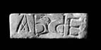
A (broad):
ABCDE
A bird's head with hooked beak and lentoid eye carved in low relief between the C and the D.
B (narrow):
gI[D]HILDME
or
+I[D]HILDME
Three tiny incised scallops attached to the top horizontal bar of the E.
C (broad):
+ǷIHSIE
þIS[N]E
[ÆA AA]
or
+ǷINSIE
þIS[N]E
[ÆA AA]
Taking up most of the left side of this face is an incised bird with outstretched wings and head turned back to bite at a vestigial plant stem which issues from its beak. It is supported on one large three-clawed foot, and its eaglelike head and the pattern of its wings and tail are skilfully conveyed with sharp incisions.
D (narrow): This face is filled with an incoherent running plant-scroll which goes right to the edge of the field. It consists of a series of hooked tendrils with curled tips which spring from a variety of junctions or nodes, one of which is a fleur-de-lis, another U-shaped. In places the stem is clipped to the edges with rounded or pointed 'clips'.
E (end) and F (end): Bird's head in false relief.
Inscriptions
A (broad): The largest and most deliberate lettering appears on face A. The five letters take up most of the available space with the height of the letters A and B being respectively 1.8 and 1.9 cm. The inscription reads: ABCDE. The 'text' therefore consists of the first five letters of the Latin alphabet. The lettering is confidently designed and well cut. Strokes are neatly finished off with serifs (as on the head-bar of A) or by broadening towards the end. A left-facing bird's head in an inchoate form of false relief similar to those on the shorter narrow edges (E and F) seems to emerge from the shoulder of the C. The lettering consists of capitals of mixed origin. The A is a decorative variation of the 'Roman' capital, with a horizontal head-bar and broken cross-bar, the strokes of which were extended to form an 'x'. Similar forms can be found amongst Insular decorative capitals on the eighth-century Ardagh Chalice (Dunraven 1874, pl. V) and, in Anglo-Saxon contexts, on a ninth- to tenthcentury knife from Sittingbourne in Kent (Okasha 1964–8, 326, table I a; Okasha 1971, 113–14; Wilson 1984, ill. 197) and perhaps also on the eighth- to ninth-century cross-shaft from Wycliffe in north Yorkshire (Lang 2001, 267, ill. 1099). The B is hard to parallel exactly in Anglo-Saxon epigraphic or display script. The form is derived from a non-capital script, in this context probably from either Anglo-Saxon or English Caroline minuscule. The angular junction of the foot of the vertical with the bow seems, however, to be an epigraphic development that is not characteristic of these scripts, although there is sometimes a suggestion of an angle in the book scripts (e.g. Bishop 1971, pls. III.5, XXIV.28; Ker 1957, pl. V). The D can probably be accounted for as a similar epigraphic simplification of a minuscule letter, in this case probably from English Caroline minuscule. The form of the C is common to both capital and minuscule scripts. The E is a broad form of the 'Roman' capital.
B (narrow): An inscription in capitals occupies all of the available space along one of the narrow edges. The interpretation of the first character is problematic. Okasha (1992a, 41–2) prefers to read the X-shaped character as 'an unusual form of the initial cross' but allows for the possibility that it was intended as the 'g' of the Anglo-Saxon futhorc. The latter seems more likely, but in either case, the sequence gIDHILD or + IDHILD presumably represents an Old English feminine personal name in hild, though the exact form of the name is uncertain. gID, with initial runic 'g', could represent OE gȳð 'battle' (cf. the more common equivalent gūð), but while this is frequent as the second element of feminine personal names, it seems only to have been noted twice as first element in Old English, both times in masculine names (Boehler 1930, 161–2). Alternatively, if the initial symbol is read as a cross, ID- might be related to the early Old English personal name Ida. However, compounds in Id-, whilst known on the Continent, are not securely attested in OE (see Redin 1919, 98–9). [2] The last two letters of this text (ME) could be read as either Latin or Old English with the meaning of 'me', in which case, the text is incomplete since it lacks a verb (such as Latin fecit ('made') or Old English ah ('owns')).
The narrowness of this face dictated that the letters had to be smaller than those on face A: H is 1 cm high and D 0.8 cm. The execution of the letters also seems rather less confident than that of the bold letters on that face. The differences may be due to a different hand and not simply the greater difficulty of cutting letters on this narrow edge. The ends of strokes are, however, deliberately finished off with serifs. There seems also to be a pendant serif, apparently deliberate, to the central 'V' of the M. The final letter (E) has been embellished with a lightly incised scale- or petal-like pattern hanging from its upper horizontal. The letters are capitals and follow standard 'Roman' forms with the following exceptions. The E is a broader letter than normal. The M is the common early medieval variant in which the outer strokes are vertical and the base of the central 'V' stops well short of the base line. What looks like a pendant serif at the base of the 'V' of the M may reflect the use of this device in Insular decorative capitals, since it appears in the display script of the eighth-century southern English Codex Aureus in Stockholm (Alexander 1978, no. 30, ill. 152).
C (broad): In contrast to faces A and B the layout of the lettering on this face is very informal, with two lines of letters of various sizes filling the available space to the right of the eagle, which therefore clearly preceded the lettering. There are further letters much more lightly incised just above the lower edge of this face and to the right of the eagle's foot. These letters are more like graffiti or doodles, and, between more or less distinct forms at either end of the line, fade into indistinct strokes and a blank area in the middle, which was either not inscribed or has been worn smooth. The letters of the inscription in the first two lines vary in height between about 0.7 cm (the first S) and the 0.4 cm (the second E). The first character of the graffiti in the final line ('Æ') is about 0.3 cm high.
The first two lines form an incomplete text in Old English. They seem to read: + ǷIHSIE ÞISNE ('+ Wihsie this'). Alternatively, if the third letter is taken as N rather than H, they can be read as: + ǷINSIE ÞISNE ('+ Winsie this'). The first word would be a personal name, and the second (þisne) the accusative singular of Old English þes ('this'), which would imply a transitive verb. The scratched letters of line 3, which may not be contemporary with lines 1 and 2, do not in their present condition supply this verb. Although the third letter looks more like than N, both ǷIHSIE and ǷINSIE could be explained as personal names. ǷIHSIE could stand for a reduced form of Old English Wihtsige: von Feilitzen (1937, 95) cites many examples of the loss of t in a group, including the eleventh-century parallel Wixie, Wixsi for Wihtsige. Less likely is a form with Old English Wig, where one would expect vocalisation and loss of g, as Wî, rather than alternation of 'g' and 'h' (see Campbell 1959, §§266–7). ǷINSIE would be a spelling of the Old English masculine personal name Wynsige (cf. von Feilitzen 1937, 429). [3]
The irregular letters in the first two lines are mixed in their forms. The Es, the first S and probably also the Is are 'Roman' capitals. The penultimate letter of line 2 must, in this context, be a reversed version of the 'Roman' capital N. Reversed N also occurs, probably in error for the conventional form, on a sculpted slab found re-used in Manchester Cathedral, and in the cloisonné enamel title over the figure of Christ on the probably Anglo-Saxon front of a crucifix of c. 1000, which is now in the Victoria and Albert Museum in London (Okasha 1971, 100, 137– 8, pls. 89, 158; Backhouse et al. 1984, 117–18, pl. XXVI). The letter before the reversed N is an alternative form of S to the capital in the previous line and was derived from a minuscule script or perhaps from Insular halfuncial. The problematic third letter in the first line is also a non-capital form, whether it is taken as H or N. With the tall vertical stroke on the left the letter looks at first sight more like an H. If so, its origins may have been in Insular half-uncial or in an Anglo-Saxon minuscule script. (It differs from the English Caroline minuscule letter in that the second stroke terminates in a vertical rather than curling back in towards the first stroke.) The form is quite often found in Anglo-Saxon inscriptions, mostly in inscriptions datable to the eighth or ninth centuries (Okasha 1964–8, tables 1 a and 1 b). If, alternatively, the letter was N, its form was drawn either from Insular halfuncial or from a minuscule script. Half-uncial or minuscule N seems to have been unusual in Anglo-Saxon inscriptions, although there is one example with the left vertical extended well above the second stroke, on the eighth- or ninth-century inscription from Falstone in Northumberland (Okasha 1964–8, tables 1 a and 1 b; Okasha 1971, pl. 39). The Old English graphs wynn and thorn appear in angular forms, as they also do on the early eleventh-century Anglo-Saxon reliquary cross in Brussels (Okasha 1971, pl. 17c). Some of the letters are finished off with light serifing.
Two forms can perhaps be identified in the indistinct graffito-like lettering along the bottom 'line'. The first of these is probably Æ. If so, it resembles the Æ on the Brussels reliquary cross (Okasha 1971, pl. 17c) in the vestigial indication of the A of the diphthong as a short diagonal. There seem also to be two, perhaps even three, examples of A with a horizontal head-bar but no crossbar, a form that could be matched in a small number of Anglo-Saxon inscriptions, including the probably eleventh-century sundial at Aldbrough in Yorkshire (Okasha 1971, pls. 1, 33, 66, 94, 158).
Inscriptions The inscriptions on the two principal faces (A and C) and along one of the long edges (B) show a surprising variety. The lettering ranges from the epigraphic formality of face A to the sprawling layout of lines 1 and 2 on face C and the scratched letters of the line below. The differences in the lettering are such that the inscriptions must have been cut by more than one hand and not necessarily at the same time. It is possible that the first phase of cutting consisted simply of the letters ABCDE on face A, the bird-heads partly cut in false relief on faces A, E and F and perhaps also the eagle on face C. The next phase may have added the lettering on face B and the scroll on face D, neither of which demonstrates the same confidence as the work attributed here to the first phase. The lettering on face C arguably belongs to a separate and probably later phase. It has clearly been fitted around the eagle and appears less skilled in execution. The lightly incised, vaguely foliate forms above the eagle seem also to be later.
The forms of the letters ABCDE on face A suggest a knowledge of manuscript display script or of formal epigraphic lettering. If the D does derive from English Caroline minuscule, the lettering is not likely to be earlier than the third quarter of the tenth century. There are symmetries, perhaps deliberate, in the layout of the five letters. The A, which is a decorative version of the capital, is treated as the initial but is balanced by the capital E. The B and D are almost mirror versions of each other. The central letter is marked with a bird-head.
Alphabets and parts of alphabets are inscribed on a number of Insular objects. The whole alphabet was publicly displayed on the early medieval cross-incised pillar at Kilmalkedar in Co. Kerry (Okasha and Forsyth 2001, 165–9) and probably also on a sandstone pillar at Lochgoilhead, Argyll (R.C.A.H.M.S. 1992, 194; Fisher 2001, 151). The other examples are on smaller, portable objects: an eighth-century ring from Flixborough (Webster and Backhouse 1991, 95–6, 99, cat. 69(b); Okasha 1992a, 45–6, pl. IIIb); a prehistoric stone axehead found at Gorteen, Co. Clare (Bradley 1979); a piece of leather found in Dublin, perhaps datable to the later eleventh to early twelfth century (Okasha 1992a, 44–5, pl. IIIa); a scrap of lead found in excavations at Waltham Abbey, Essex and inscribed probably some time between the ninth and early eleventh centuries (Okasha 1983, 100, pl. XIa). Christian symbolism of the sort discussed for Ireland by Márkus (1996) and perhaps also an apotropaic intention (Webster and Backhouse 1991, 96) may explain the full or partial alphabets on the stone pillars and on the ring. On the other hand the minuscule alphabet on the lead scrap from Waltham more probably reflects the teaching or learning of the alphabet. The first five letters of the alphabet on the Barton St David stone could have been supplemented by similar sequences on other stones to complete the alphabet. The mixture of capital and non-capital forms is not well suited to teaching the alphabet. If it was more than a 'trial piece', some kind of Christian symbolism or talismanic purpose may have been intended.
The capitals on one of the long narrow faces (B) are less carefully laid out and less skilfully cut. If the first character is the Anglo-Saxon rune 'g', this text is one of a small group of Latin alphabet inscriptions in England that include one or more runes with the Latin letters. There are examples on stones from Alnmouth and Chester-le-Street and on rings from Manchester and Llysfaen (Okasha 1971, 47–8, 62, 89, 98–9; Page 1999, 219–20). The text seems to be an incomplete statement with a subject and an object (me) but no verb. It could have been intended to be either Latin or Old English. The me, whether Latin or Old English, would fit either a maker or an ownership inscription (cf. Okasha 1994).
The first two lines of the text of the other broad face (C) differ from the inscriptions on faces A and B in their undisciplined layout and in the use of an introductory cross. The lettering on face C resembles that on A in combining capitals with non-capital forms but is much less skilled in execution. The letter forms can be matched in various Anglo-Saxon inscriptions. The mixture of capital and non-capital forms is of a similar sort to what can be seen in the more skilful lettering on the Brussels reliquary cross (Okasha 1971, pl. 17c). The status of the graffito lettering and its relationship to the first two lines is unclear. The text of the first two lines is clearly in Old English and, like that on face B, lacks a verb to complete and clarify the statement. The text on face C appears, like that on face B, to be the opening of an ownership or maker inscription. The inscriptions on faces B and C may have been cut by successive owners.
This is an enigmatic object which has no parallels in the region, not even in the stone employed which could have been imported. This is indeed so smooth and fine grained that, like the motif pieces of Ireland (O'Meadhra 1979 and 1987) which are inscribed on a smooth surface of bone or stone (often slate), it could have been a similar product. On the other hand the motif pieces are often carved on irregular fragments of stone or bone and this object is very deliberately shaped, whether for this purpose or for another. Its form and scale, and even th stone type, would be suitable for a pocket whetstone, for example.
There is a certain similarity also in the elements involved to sketches in some late Saxon manuscripts: the bird's head with the curving beak which occurs on the ends (Ills. 168–9), and in a more assured manner on face A (Ill. 164), is one which is commonplace in the type of the Evangelist symbol of St John (see the sketch on the flyleaf of BL Add. MS 47967, flyleaf iii (Temple 1976, no. 8, ill. 28)), but eagle-like bird's heads frequently occur as an element of initials in the tenth/eleventh century (Wormald's type IIb (1945, 123): see Temple 1976, no. 30, ills. 110–14). The incised eagle with wings displayed on face C (Ill. 166) is also a type which could have been copied from an Evangelist symbol in another medium. Higgitt's suggestion that at least two hands are involved is important, especially since the plant sketch on face C appears secondary, and the bird has not the normal stance of the pecking birds in plant-scrolls (compare the frame on Cambridge, Corpus Christi College, MS 183, fol. 1v (Temple 1976, no. 6; see Ill. 533)). The plant-scroll on face D (Ill. 167) has the coiled tendrils in common with the plant sketch on face C, and Higgitt has suggested (pers. comm.) that 'it shows knowledge of the type of plant-scroll employed with skill in the 930s in the initia on fol. 6r of the Cambridge, Corpus Christi MS 183 (Temple 1976, ill. 18)'. This could imply that this scroll might have been inspired at a much later date than the pre-Conquest period, and indeed the crispness of some of the lettering and ornament could indicate a later 'trial piece'. On the other hand, elements such as the U-shaped clips are a distinctive feature of scrolls in this area from the Anglo-Saxon period (see introduction p. 51), so it seems most likely that this piece was produced around the late tenth century, and that this was done on two occasions although how far apart they were is problematic. Higgitt's detailed analysis of the lettering has identified at least two phases of cutting, and some doubts about the antiquity of some of the lettering (see p. 67).
[1] The transcriptions of the inscriptions are by J.H. (for the conventions used, see Cramp 1991, xlix). The description of the ornament is by R.C.
[2] The discussion of the personal name is by David Parsons.
[3] The discussion of the personal name is by David Parsons.
