Select a site alphabetically from the choices shown in the box below. Alternatively, browse sculptural examples using the Forward/Back buttons.
Chapters for this volume, along with copies of original in-text images, are available here.


Object type: Imposts and inscribed voussoirs [1]
Measurements: a: H. 26 cm (10.2 in); W. 92 cm (36.2 in); D. 50 cm (19.7 in); b: H. 28 cm (11 in); W. 89 cm (35 in); D. 55 cm (21.7 in); c: (letters): H. c. 15 cm (5.9 in); D. Built in
Stone type: a–b, very pale orange to pale yellowish-brown, medium- to coarse-grained, oolitic limestone, in large blocks; Combe Down Oolite, Great Oolite Formation of the Bath area, Great Oolite Group, Middle Jurassic; c, Greenish-grey, fine- to medium-grained, glauconitic sandstone; Hurdcot stone, Upper Greensand, Gault Group, Lower Cretaceous
Plate numbers in printed volume: Ills. 429-430, 433-437
Corpus volume reference: Vol 4 p. 253-255
(There may be more views or larger images available for this item. Click on the thumbnail image to view.)
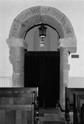
The jambs of the arch are of square section and support square imposts. That on the east side, (a), has the north and south faces cut back flush with the wall. The upper and lower edges of the west face are decorated with bold cable mouldings. The impost on the west side, (b), has its north face cut back flush with the wall, but the south face projects slightly and has the edges decorated with cable mouldings, as are the upper and lower edges of the east face. The arch head, (c), is also of square section and is composed of six non-radially jointed through stones.
Inscription The inscription (Okasha 1971, 56; eadem 1992b, 334, 337, 340, 344; Gameson and Gameson 1993) is on the north face of the arch (Ills. 429–30, 433). The letters follow its curve, radiating from its centre and occupying the whole of the available area. They are large (ranging from about 13.1 and 15.5 cm (5.1 and 6.1 in) in height) and quite deeply cut. Three of the letters at the top of the arch (GEC) are cut onto an inserted modern block that is used to patch the face of the Anglo-Saxon through-stone. Hill noted that these three letters were cut on '... a piece of white stone inserted as a patch ...', but he does not make it clear when the patching was done (Hill 1898, 85). It is likely that they were copied from the letters on the original, damaged, stone during this restoration. There may perhaps also have been some re-cutting of other letters at the same time. The letters are picked out in modern red paint. This replaces medieval colour observed at the time of the discovery, when the inscription was described as having been coloured red with '... a red line above and below the letters ...' (Hill 1897a, 409; Tweddle 1990, 150). The letters are capitals and the language is Old English. There is no word-division or punctuation. Neither is there an initial or final cross to help resolve the question as to whether the text is complete in itself. The inscription may be transcribed:
H/ERSǷVT/ELAÐSEO[--Ƿ]YDRÆDN/ESÐE
Assuming that the modern letters GEC are an accurate copy of what originally stood in their place, the text may be read as follows:
HER SǷVTELAÐ SEO GECǷYDRÆDNES ÐE
Translation is more problematic. Okasha has suggested either 'Here is shown the agreement (or 'covenant') which --' or 'Here is shown the agreement (or 'covenant') to you' (Okasha 1971, 56; cf. Gameson and Gameson 1993). In the first case the text must be incomplete as it stands (see below, Discussion). More recently, taking the verb as being active and governing an object now missing, she offers revised alternative translations: 'Here the agreement reveals to you [that ...]' or 'Here the agreement which ... reveals ... ' (Okasha 1992b, 337). The lettering is bold and simple (Ills. 430, 432). The strokes are of more or less even breadth. There is no real seriffing but strokes seem to expand slightly towards the terminals. The details are, however, not very clear, as the carved edges are rather worn.
The lettering is somewhat tall in proportion and somewhat tightly packed. In the effort to combine a large letter size with a relatively long text the designer also used the three ligatures (H/E, T/E, and N/E). The capitals approximate to the standard Roman forms with the following exceptions. A has a top which projects to the left but not to the right. (This detail seems to have been missed in the repainting.) The cross-bar of the A also projects to the left and within the letter it slopes down to the right. The diagonal of N (in ligature with E) meets the right vertical a little short of its base. S appears once in an angular variant and once in the standard round form. Y consists of a short diagonal on the left which meets the full-length diagonal on the right about half-way down. Capital forms of the Old English letters eth and wynn are used. The modern inserted block (Ill. 430) has square forms of C and G which may represent the forms of the original letters. (The G is similar to the fragmentary letter of Breamore no. 04 (see below).)
The paint observed in 1897 may have been original, but alternatively could represent a later medieval modification.
The arch can be dated by the fact that it is in situ in a fabric which can be placed in the late pre-Conquest period (Taylor and Taylor 1965–78, i, 94–6, fig. 42, pls. 405–6). Support for this dating derives from the use of cabled mouldings. Elsewhere in south-east England, as at Dartford, Kent, and Little Munden and Walkern 2 in Hertfordshire, these are exclusively a late phenomenon.
Inscription The size of the lettering and the prominently architectural arrangement of the inscription on the extrados of an arch are both without parallel in surviving Anglo-Saxon inscriptions. The idea of large lettering prominently displayed in architecture derives ultimately from antique Roman models, but architectural inscriptions on a monumental scale might also have been known from early medieval Italy, as is clear from recent work at San Vincenzo al Volturno (Mitchell 1990, 205–11). It is possible that the use of the extrados as a field for an inscription might derive from the example of inscriptions in mosaic in some churches in Rome (see Introduction) or elsewhere in Italy.
The very precise dating of the lettering to around 'the close of the reign of Ethelred II' (d. 1016) on the basis of lettering on coins (Green and Green 1951, 7) is unconvincing. Such precision is not possible with a purely palaeographical dating; furthermore, letters on coins are technically quite different (being formed with punches on the die) and seem often to have been independent of traditions of lettering in manuscript and on stone. The Breamore lettering would, however, fit well into the later tenth- or early eleventh-century period of the architecture with which it is likely to be contemporary (see Introduction).
It is not certain whether the 'agreement' or 'covenant' referred to in the text is religious or legal in meaning. Okasha thinks it is more likely to be religious (Okasha 1971, 56), and the fact that the text is prominently displayed near what may have been the original position of the altar, at the east end of the nave, supports her view. Deansley, on the other hand, argues that the text is a 'legal record' and points to undeniable parallels for the wording in documents in Old English, although none is exact (Deansley 1963, 350–1). She cites several examples of documents opening with the clause: 'her swutelað'. Gecwidrædnes is not otherwise attested (Napier 1903–6, 292–3), but gecwidrædden ('agreement', 'contract', etc.) is known (Bosworth and Toller 1898, s. v.). A new study of this inscription provides a very thorough examination of its text and suggests an ingenious interpretation of its meaning (Gameson and Gameson 1993). The authors argue that the statement in the inscription is complete in itself and that it should be translated as: 'Here is made manifest the covenant to you.' The covenant is that given by God to Noah after the flood (Genesis 9, 8–17) and the arch itself could have been an iconographic representation of the sign of that covenant, the rainbow (arcum). Such a text might well have referred to the function of the porticus beyond the arch, perhaps as a private chapel or baptistery.
Breamore nos. 3–4 show that 2c was probably not the only architectural inscription on the original fabric of the church. The lost arches to the north, east and west might have carried comparable inscriptions. If a single text were to be read over the inner faces of the four arches of the crossing, it would presumably have followed the normal left to right direction of reading. If, therefore, the text began on the surviving southern arch - and her swutelað sounds like the opening of a text - it would have concluded on the eastern arch which opened into the chancel. Alternatively, some or all of the arches could also have carried texts that were complete in themselves.
