Select a site alphabetically from the choices shown in the box below. Alternatively, browse sculptural examples using the Forward/Back buttons.
Chapters for this volume, along with copies of original in-text images, are available here.


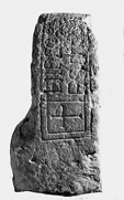
Object type: Grave-marker [1]
Measurements: H. 58 cm (22.8 in); W. 51 cm (20 in); D. 27.5 cm (10.8 in)
Stone type: Grey (with a greenish tinge), fine-grained (0.2 mm quartz grains), glauconitic sandstone, possibly with a cherty cement; Upper Greensand, Gault Group, Lower Cretaceous; perhaps from near Kingsclere, Hampshire
Plate numbers in printed volume: Ills. 482-489
Corpus volume reference: Vol 4 p. 271-273
(There may be more views or larger images available for this item. Click on the thumbnail image to view.)
The stone is straight-sided with a semicircular head.
A (broad): The decorated portion of this, the principal face, comprises a recessed field following the outline of the stone from 17 cm (6.7 in) above the base, the edge of the recess being stepped. An incised bordering line below the recess may have outlined the whole, but is obscured by damage. Within the recess is a high-relief, half-length robed figure with a cruciform nimbus. The robe is draped over the shoulders, and is looped over the figure's left arm which holds a book. The right arm is raised in blessing.
B, D and E (narrow sides and top): Inscription The inscription (Okasha 1971, 125–6) is set within a panel on the flat surface of the curving outer edge of the monument (Ills. 485–9). The panel occupies most of the available space and is defined by an incised framing line. Within the panel the inscription is set out in an orderly manner in two lines and at the left-hand end of the panel there is an incised cross which occupies the height of the two lines of text (Ill. 482). The cross is marked off by a rectangular incised frame within the main framing lines which continues and is overlain by the first few letters of the inscription (Ill. 489). A group of three points marks the end (Ill. 485). The letters are between about 4.6 and 6.3 cm (1.8 and 2.5 in) in height. The inscription has suffered damage and abrasion, especially at the top of the stone. The text, which seems to have had no word-division, is in capitals and can be transcribed as follows:
+HICCO[RPV]S[F]RI[ÐB]VRG[AEREQ]VI
E[SC]IT[INP.C]E[.S]EPVLTVM:
The text is clearly in Latin and, apart from the personal name, the reading is generally straightforward. Okasha reads the name as FRI[Ð]BVRGAE (genitive), that is, Friðburg, a recorded feminine personal name. This may have been the intended name, but the first letter has a short horizontal stroke at the bottom which makes it at first sight like an E, although the horizontal is not as pronounced as in the other examples of E on the stone (Ill. 488). This may be an example of 'E-shaped F' (see below), if it is not simply a carver's error. The fourth letter (Ill. 488) looks more like O with damage to its upper right quadrant than eth (usually shown as a D with a horizontal stroke cutting the vertical in inscriptions in capitals). Searle accepts Hübner's reading of O, and therefore records the name as Frīoberga (Searle 1897, 247; Hübner 1876, 61). If, as seems likely, the intended reading was FRIO-, this should be identified as the recorded but rare first element Frīo-/Frēo-. In this case, assuming that the name form represents the West Saxon dialect, the spelling īo would suggest a date not much later than the ninth century (Campbell 1959, 125–6).2 There is confusion or indecision at the end of the name. The penultimate character (Ill. 487) has been cut as two different letters: V and A. The V is cut more deeply than the A. It looks as if the A, which is required for the genitive in AE, is a modification of the earlier V. The change was apparently made while work was in progress. The result is now confusing, but if the inscription were originally painted, as seems to have been usual (see Introduction) the corrected reading would have been picked out in paint.
The text may be read as:
+ HIC CORPVS FRI[O]BVRGAE (or FRI[Ð]BVRGAE?) REQVIESCIT IN [PA]CE[M] SEPVLTVM :
(Translation: '+ Here rests the body of Frioburga (or Frithburga?) buried in(to) peace.') in pacem seems to be the most likely reading and, if the accusative is deliberate and not just a mistake for the more normal in pace, it implies burial into peace rather than merely resting in peace.
Much of the finer detailing of the lettering is lost through wear. Letter strokes seem to have been of fairly even thickness and strokes terminate in fairly pronounced, almost wedge-shaped, serifs. The capitals are of standard 'Roman' forms, with the following exceptions. C is square (Ill. 489). F (if that is what it is: see above) is unusual in having a third short horizontal at the bottom of the vertical. G is angular (Ill. 487). M has vertical outer legs and a shallow 'V' (Ill. 486). Q is the uncial letter (Ill. 486).
C (broad): In the curved upper part is a semicircular field outlined by a double-incised line, and containing a stylised plant motif. The scrolls of the plant are disposed symmetrically on either side of the vertical axis of the field, three subsidiary scrolls occupying the interstices between the main scrolls and the edge of the panel. Below this field the stone thickens abruptly, the upper edge of the thickening being chamfered.
The content of the inscription provides direct confirmation of the function of the piece.
The cruciform nimbus of the figure on face A identifies him as Christ. As noted above (Chap. V), the leafless tree-scroll within a semicircular border on face C was a popular motif in the late eighth and early ninth centuries, particularly in metalwork. It finds an almost exact parallel on a pressblech disc from Hedeby which is of ninth-century date and Anglo-Saxon origin (Fig. 13d; Capelle 1968, no. 72, taf. 25.1). The motif occurs in sculpture locally on a cross-shaft from Winchester (High Street; Ill. 679).
Inscription The underlying formula of the text, hic requiescit, is common in Christian inscriptions from the fifth century onwards and was used elsewhere in Anglo-Saxon England, at Monkwearmouth, co. Durham (Okasha 1971, 101; Higgitt 1979, 365; Cramp 1984, i, 124, ii, pl. 110 (604)), Canterbury, Kent, and Ripon, Yorkshire (Cabrol and Leclercq 1907–53, VI.2, col. 2373 (s. v. Hic); Higgitt 1979, 365). Hic requiescit combined with in pace is common as an introductory formula in fifth- and sixth-century inscriptions, especially in southern France and Italy, and continues to be used in the region of the Rhine for the next century or so (Krämer 1974, 39–47, 119 (Anhang 1)). Diehl cites an early medieval epitaph in Bologna containing the wording 'Martini . corpus hic in pace requiescit sepultum . .' (Diehl 1925–67, i, 455–6, no. 2349), the same words as at Whitchurch, though not in the same order. There is unlikely to be a direct connection. Instead the two epitaphs reflect a common early medieval epigraphic tradition. Behind this wording there might ultimately be a reminiscence of Ecclesiasticus 44, 14: 'Corpora ipsorum in pace sepulta sunt'. The Whitchurch epitaph sounds too as if it might have been adapted from a metrical model. The last two words would certainly fit the end of a hexameter.
As on London (All Hallows) no. 1, the form of the seriffing probably reflects the wedge serifs of Insular book scripts of around the eighth century (Bischoff 1990, 86) and argues for a date not much later than the end of the ninth century.
There seem to be no parallels in pre-Conquest inscriptions in England for the form of the possible letter F (Okasha 1968), but Nash-Williams illustrates three examples on inscriptions in Wales which he dates to the fifth or early sixth centuries (Nash-Williams 1950, 102, 195, 213, 224–5). The form is found on the continent in some Early Christian and early medieval inscriptions (Le Blant 1896, 345–9; Gauthier 1975, 28). In origin the bottom horizontal is an exaggerated treatment of the base serif of the Roman capital script (Bischoff 1990, figs. 1–3). None of these parallels is close to the present example, so a carver's error seems the more likely explanation here.
The setting of the inscription on the outer rim of the monument between the two decorated vertical faces is unusual, but was perhaps paralleled on Rochester 3 (Ills. 147–50). It could be fairly conveniently read, when set in the ground as a grave-marker, although, given the curvature of the stone, it would not be possible to see the whole of the inscription from the same viewpoint. The text is arranged to be read by a reader who is facing face A, the side with the figure of Christ.
