Select a site alphabetically from the choices shown in the box below. Alternatively, browse sculptural examples using the Forward/Back buttons.
Chapters for this volume, along with copies of original in-text images, are available here.


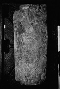
Object type: Grave-cover
Measurements: L. c. 102 cm (40.2 in); W. c. 43 > 39 cm (17 > 15.4 in); D. c. 15 cm (5.9 in)
Stone type: Pale greyish-brown, finely glauconitic, fine-grained sandstone; Thanet Beds, Palaeogene, Tertiary; from Reculver or Pegwell Bay, Kent
Plate numbers in printed volume: Ills. 24-28
Corpus volume reference: Vol 4 p. 128-131
(There may be more views or larger images available for this item. Click on the thumbnail image to view.)
Grave-cover, tapering towards the foot. The upper left-hand corner has been carefully cut away, and the lower left-hand corner is roughly broken.
A (top): On the upper face is an inscription. There is a large space between the words GER[R]ALD and [:]FILIVS EDVVARDI (lines three and four respectively (Ill. 26)). This is partially filled by two incised sketches. Close to the D of GER[R]ALD is a vertically-placed bird facing the head of the stone. The folded wings are carefully delineated and it has a heavy beak. Above the AR of EDVVARDI is a vertically placed leonine quadruped facing the foot of the stone. Its offside leg is raised.
Inscription The inscription (Okasha 1983, 88–9) is cut into the roughly smoothed surface of the uneven face of this stone. There are several areas of pitting and the letter-cutter has taken care in laying-out the lettering to avoid the worst of the potholes. This would explain some of the oddities in the layout. The incised drawing of the lion and the bird are space-fillers in an area below the second line where the pitting was too bad for uninterrupted lines of lettering. The fifth line starts some way in from the left-hand edge to avoid a crack (Ill. 26). Similarly the last three lines are squeezed up into the left side of the stone because of damage down its centre at this point (Ill. 28). The two ligatures occur at the ends of lines (M/E in the seventh line and H/E in the ninth) and again look like devices for avoiding craters (Ills. 27ndash;8). That the pitting is earlier than the lettering can be demonstrated where, in the fifth line, the cutting of the lower parts of both letter Is of OBIIT continues down into the large depression below the line (Ill. 26). In two places letters have been damaged after (or perhaps while) being cut (the second R of GER[R]ALD in the third line and the Q of QVI in the fifth (Ill. 26)).
The lettering is arranged in surprisingly neat lines considering the condition of the stone. There is some variation in letter height within each line. The average height of letters in the first, second, and fourth to eighth lines is about 3 cm (1.2 in) with some letters reaching about 3.5 cm (1.4 in). The third line is about half-size with letters of around 1.5 cm (0.6 in). The last three lines, the ninth and especially the tenth (c. 2.2–2.7 cm (0.8–1.2 in)) and eleventh (c. 1.9 cm (0.75 in)) decrease in height again.
It is likely that the half-size D in the second line (1.5 cm (0.6 in)) and the whole of the awkwardly-arranged third line are after-thoughts (Ill. 25). The shallowly carved and serif-less QVI at the end of the second line is probably another addition. (On these see further below.)
The lettering is quite well preserved and there is no indication of any loss to the text at either top or bottom. The inscription, which is in capitals, can be transcribed:
[C]ONDITVS HIC
EST E
GER[R]ALD
[
[Q]VIOBIIT[
I[N]XIIIKL IVNII
SEPDICITOANIM/E
REQVIESCATIN
[P]ACE[
RIVV[A]LD
ME [FE]CIT
The language is Latin and the text can be edited as follows:
CONDITVS HIC EST EDZIE QVI GERRALD [:] FILIVS EDVVARDI QVI OBIIT [:] IN CHR(IST)O IN XIII K(A)L(ENDAS [or - ARVM?]) IVNII SE(M)P(ER) DICITO ANIME REQVIESCAT IN PACE [:] HERIVVALD ME FECIT.
(Translation: `Here was buried Edzie, who [...] Gerrald, son of Edward, who died in Christ on 20th May. Always say for his soul: "May he rest in peace." [or, taking ANIME as a mistake for ANIMA,` Always say: "May his soul rest in peace."'] Heriwald made me.')
Okasha suggests that there is a letter missing between the two Rs of GERRALD. A gap was left between these two letters because of the condition of the stone, but there is no sign of there ever having been a letter in this gap (Ill. 25). There seems to be a break in the sense after the first QVI. There is some uncertainty about the expansion of the abbreviated date formula.
The lettering consists of quite confidently designed, slightly uneven, capitals. The letter strokes are even and slender, and show little or no modelling. Strokes are normally finished with small, neatish serifs. The letters nearly all follow Roman capital forms. The following should be noted. With one exception (in the third line) A has a horizontal cross-bar. It appears both with and without a very short cross-bar over the top. E is generally the Roman capital, but there is one example of the uncial letter (Ill. 28). A tall form of the letter I seems to be used deliberately in some cases: IN (line six); DICITO (line seven); REQVIESCAT (line eight). M has (more or less) vertical sides and a short central V. O is circular and the first O (in the first line) has a dot near the centre (Ill. 25). Because the stone is extensively pitted, it is impossible to be sure whether this is a deliberate and original feature. Capital P is used for Greek rho. Q is the capital with simple rightward-curving lines as tails in lines two and five; in line eight the tail consists of two curving lines that converge to form a horn-like form (Ill. 27). X is plain in the numeral in line six. In line five, where it represents the Greek chi, the rightward-leaning stroke curves over at the top. VV is used for W in English names. Z makes a very rare appearance in the name in the second line, although it is conceivable that the letter is an accidentally reversed angular S.
Word-division is inconsistently indicated: sometimes with a gap; sometimes not at all; and sometimes apparently with a mid-line point (although, given the pock-marked surface of the stone, it is possible that these are accidental marks). Bars over words or through letters are correctly used to mark abbreviations. The normal nomen sacrum abbreviation is used for Christo.
Grave-cover, tapering towards the foot. The upper left-hand corner has been carefully cut away, and the lower left-hand corner is roughly broken.
A (top): On the upper face is an inscription. There is a large space between the words GER[R]ALD and [:]FILIVS EDVVARDI (lines three and four respectively (Ill. 26)). This is partially filled by two incised sketches. Close to the D of GER[R]ALD is a vertically-placed bird facing the head of the stone. The folded wings are carefully delineated and it has a heavy beak. Above the AR of EDVVARDI is a vertically placed leonine quadruped facing the foot of the stone. Its offside leg is raised.
Inscription The inscription (Okasha 1983, 88–9) is cut into the roughly smoothed surface of the uneven face of this stone. There are several areas of pitting and the letter-cutter has taken care in laying-out the lettering to avoid the worst of the potholes. This would explain some of the oddities in the layout. The incised drawing of the lion and the bird are space-fillers in an area below the second line where the pitting was too bad for uninterrupted lines of lettering. The fifth line starts some way in from the left-hand edge to avoid a crack (Ill. 26). Similarly the last three lines are squeezed up into the left side of the stone because of damage down its centre at this point (Ill. 28). The two ligatures occur at the ends of lines (M/E in the seventh line and H/E in the ninth) and again look like devices for avoiding craters (Ills. 27ndash;8). That the pitting is earlier than the lettering can be demonstrated where, in the fifth line, the cutting of the lower parts of both letter Is of OBIIT continues down into the large depression below the line (Ill. 26). In two places letters have been damaged after (or perhaps while) being cut (the second R of GER[R]ALD in the third line and the Q of QVI in the fifth (Ill. 26)).
The lettering is arranged in surprisingly neat lines considering the condition of the stone. There is some variation in letter height within each line. The average height of letters in the first, second, and fourth to eighth lines is about 3 cm (1.2 in) with some letters reaching about 3.5 cm (1.4 in). The third line is about half-size with letters of around 1.5 cm (0.6 in). The last three lines, the ninth and especially the tenth (c. 2.2–2.7 cm (0.8–1.2 in)) and eleventh (c. 1.9 cm (0.75 in)) decrease in height again.
It is likely that the half-size D in the second line (1.5 cm (0.6 in)) and the whole of the awkwardly-arranged third line are after-thoughts (Ill. 25). The shallowly carved and serif-less QVI at the end of the second line is probably another addition. (On these see further below.)
The lettering is quite well preserved and there is no indication of any loss to the text at either top or bottom. The inscription, which is in capitals, can be transcribed:
[C]ONDITVS HIC
EST E
GER[R]ALD
[
[Q]VIOBIIT[
I[N]XIIIKL IVNII
SEPDICITOANIM/E
REQVIESCATIN
[P]ACE[
RIVV[A]LD
ME [FE]CIT
The language is Latin and the text can be edited as follows:
CONDITVS HIC EST EDZIE QVI GERRALD [:] FILIVS EDVVARDI QVI OBIIT [:] IN CHR(IST)O IN XIII K(A)L(ENDAS [or - ARVM?]) IVNII SE(M)P(ER) DICITO ANIME REQVIESCAT IN PACE [:] HERIVVALD ME FECIT.
(Translation: `Here was buried Edzie, who [ ... ] Gerrald, son of Edward, who died in Christ on 20th May. Always say for his soul: "May he rest in peace." [or, taking ANIME as a mistake for ANIMA,` Always say: "May his soul rest in peace."'] Heriwald made me.')
Okasha suggests that there is a letter missing between the two Rs of GERRALD. A gap was left between these two letters because of the condition of the stone, but there is no sign of there ever having been a letter in this gap (Ill. 25). There seems to be a break in the sense after the first QVI. There is some uncertainty about the expansion of the abbreviated date formula.
The lettering consists of quite confidently designed, slightly uneven, capitals. The letter strokes are even and slender, and show little or no modelling. Strokes are normally finished with small, neatish serifs. The letters nearly all follow Roman capital forms. The following should be noted. With one exception (in the third line) A has a horizontal cross-bar. It appears both with and without a very short cross-bar over the top. E is generally the Roman capital, but there is one example of the uncial letter (Ill. 28). A tall form of the letter I seems to be used deliberately in some cases: IN (line six); DICITO (line seven); REQVIESCAT (line eight). M has (more or less) vertical sides and a short central V. O is circular and the first O (in the first line) has a dot near the centre (Ill. 25). Because the stone is extensively pitted, it is impossible to be sure whether this is a deliberate and original feature. Capital P is used for Greek rho. Q is the capital with simple rightward-curving lines as tails in lines two and five; in line eight the tail consists of two curving lines that converge to form a horn-like form (Ill. 27). X is plain in the numeral in line six. In line five, where it represents the Greek chi, the rightward-leaning stroke curves over at the top. VV is used for W in English names. Z makes a very rare appearance in the name in the second line, although it is conceivable that the letter is an accidentally reversed angular S.
Word-division is inconsistently indicated: sometimes with a gap; sometimes not at all; and sometimes apparently with a mid-line point (although, given the pock-marked surface of the stone, it is possible that these are accidental marks). Bars over words or through letters are correctly used to mark abbreviations. The normal nomen sacrum abbreviation is used for Christo.
Okasha suggests that the inscription fits around the carving and that it may be secondary but, as suggested above, it seems more likely that the carvings are space-fillers in areas too pitted for lettering. She also suggests that the lower end is incomplete, and that some of the inscription may have been lost. There is, however, no evidence that either the stone or the inscription is incomplete.
Inscription The lettering is remarkable for the lack of angular alternatives to round letters (with the possible exception of angular S) and of round alternatives to angular letters (with one exception, the uncial E in the last line). A without a cross-bar is rare, but can be found in a number of Anglo-Saxon inscriptions of the ninth century and later (Okasha 1968; eadem 1971, pls. 1, 19a, 33, 66, 94, 107a, 117, 135, and 158; Wilson 1984, pls. 205–7; see also Rochester 3). Tall I was used in Classical Roman inscriptions originally to indicate a metrically long I, and the idea may have been suggested by looking at Roman inscriptions, perhaps in Canterbury itself. Here it seems to be used for variety as an alternative to the letter of standard height. O with a dot in the centre can be seen on the tenth-century censer cover from Pershore, Worcestershire, and perhaps too in stone inscriptions from Lancaster, Lancashire, and Thornton-le-Moors in Cheshire (Okasha 1968, 325, 327; Okasha 1971, pls. 68b, 100; Higgitt 1983, 27; Deschamps 1929, 15).
The general aspect and the proportions of the lettering, with its thin, even strokes, and predominantly Roman forms, is not unlike that of the Bayeux Tapestry (Wormald 1957, 177, pls.). If one makes allowances for the different media, the seriffing is also similar. The Bayeux Tapestry uses a few round letters (E, H, and, on two occasions each, D and M) but no angular variants: a similar picture on a much larger scale to that on this monument. The spelling of EDVVARD with a double V appears, for example, in the first word on the Tapestry. These similarities suggest that the stone and the textile are approximately contemporary, although they do not, of course, prove it. The Tapestry has been attributed to Canterbury by some scholars (Wormald 1957, 34).
The main part of the text on this grave-marker consists of memorial formulae. The first section identifies the deceased, giving his name and that of his father. The opening phrase, CONDITVS HIC EST, echoes, perhaps consciously, an Early Christian formula; compare hic est conditus in Rome or hic conditus in Trier (Diehl 1925–67, no. 3056; Gauthier 1975, 515–16; Krämer 1974, 39). The day and month of his death are recorded, which is necessary for annual commemoration, but not the year. The date is introduced by the phrase OBIIT IN CHRISTO, a formula which is again characteristic of early inscriptions. It is fairly common around the sixth century in the Viennoise (Descombes 1985, 125; cf. Le Blant 1856–65, ii, nos. 393–4, 407, 466a, 693). The reader of the epitaph is then addressed, as in many medieval epitaphs, and asked to pray for the repose of the soul of the deceased (Favreau and Michaud 1974, 65, 73; idem 1977, 63; idem 1978, 143; Favreau et al. 1979, 24, 31; idem 1982, 24, 137–8). The use of the requiescat in pace formula may be an argument for dating the inscription to no earlier than the eleventh century. Rieckenberg's study of the origins of the formula concludes that it originated in the Mainz Romano-German Pontifical, and the earliest inscription that he cites as using it is the epitaph of Archbishop Erkenbold of Mainz, who died in 1021 (Rieckenberg 1966). There is, however, a number of earlier examples, although the formula seems to have been taken up much more widely following its use in the Romano-German Pontifical in the tenth century (Jörg 1984, 113). The text finishes with a maker formula of the common 'speaking object' type: HERIWALD ME FECIT. Which aspect or aspects of the production, or possibly patronage, Heriwald was responsible for is not specified (see further Introduction, and Stratfield Mortimer no. 1, Discussion).
The significance of the dative case of ANIME in line seven is not immediately clear. One possibility is that it is a dative of advantage, like that in an early twelfth-century epitaph in Poitiers ('-- defuncto dicito psalmos atque pater noster quod sibi sit requies': (Favreau and Michaud 1974, 73)). Alternatively, the author of the text has misunderstood his source. Verse epitaphs of two of the tenth-century archbishops of Mainz included lines calling on the reader to pray to Christ for the soul of the departed (Strecker 1939, 320). The lines in question are: 'Dic anime requiem da cuius, Christe, perennem . .' ('Say: Christ, grant eternal peace to his soul . .'); and 'Cuius dic animae miserere, piissime Christe . .' ('Say: Most gracious Christ, have mercy on his soul . .'). Here we have the same conjunction of the imperative of dicere and the dative of anima, which could be confusing if read without modern punctuation. If some such epitaph is the source, ANIME has been copied without full understanding, but is perhaps taken as the subject of REQUIESCAT.
There are four personal names (Okasha 1983, 88–9). EDZIE (apparently modified from an original EZIE) is explicable as a late form of the Old English masculine name Eadsige, and the spelling is comparable to Domesday Book's Edzi (Okasha 1983, 89). If EZIE was the original spelling, that in its turn would correspond to Domesday Book's Ezi (Feilitzen 1937, 236–7). GERRALD is presumably a form of the Old German name Gerald. It was known in England at the end of the Anglo-Saxon period (occurring in Domesday Book) and was common in France (Feilitzen 1937, 27–9, 260; Morlet 1968, 100; Dauzat 1984, s. v. Géraud). EDWARDI (genitive) and HERIWALD are Old English masculine personal names (Okasha 1983, 89). As on the Bayeux tapestry, vernacular names are not latinized in the nominative.
As noted above, the small D in the second line and the whole of the third line with the name GERRALD look like additions. These letters are similar to those of the main inscriptions but smaller and awkwardly fitted in. The D may have been added because it had been omitted in error, or in order to clarify the pronunciation. GERRALD was probably Eadsige's (Norman-French?) alias. These additions need not have been much later; in fact they could have been added while work was in progress. The status of the QVI at the end of the second line is puzzling, since it has no dependent verb. The letters appear to be more shallowly carved than the rest of the inscription, and they show no trace of serifs. Either they had been lightly incised prior to cutting and were never fully cut, perhaps because a change in wording made them redundant, or they were an attempt to link the probably added name with the first name.
This epitaph could date to some time in the late pre-Conquest period, but similarities to the Bayeux Tapestry and the combination of three Old English names (one of which is in a late form shared with the Domesday Book) and a probably Norman-French name (whether original or added) perhaps make a date shortly after the Conquest more likely for the inscription. St Augustine's seems to have kept a distinct English character at least until the repression of the revolts against the Norman Abbot Wido in the late 1080s (Knowles 1963, 115–16; Dodwell 1954, 24–5). The use of a piece of stone in such poor condition could imply a period of comparative poverty or disorganization, and the change of name, if that is what it is, might illustrate a process of Normanization.
